


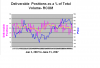
NSE gives a figure of deliverable positions as a percentage of total traded volume and it is interesting to see the relationship between price and deliverable positions. Here is a chart of RCOM plotted against the deliverable position. The yellow line is the 10 day average of dp.
Interpretation: 1.Price going up but d.p. not - Bad, 2. Price going down and dp increasing - Worse! 3. Price and dp both going up - Good. and finally, price and dp both going down- a bottom is being formed. Wait and watch!
ss")
Interpretation: 1.Price going up but d.p. not - Bad, 2. Price going down and dp increasing - Worse! 3. Price and dp both going up - Good. and finally, price and dp both going down- a bottom is being formed. Wait and watch!
ss
Attachments
-
 23 KB Views: 240