


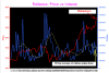
I experiment a lot on Excel and one of my favorites is to study the price volume relationship in a different way than conventional charts.
Volume is overlayed right on the price and I think this method 'connects' volume to price in a better way, than conventional charts, where volume is overlayed below the price and we tend to take it for granted!
Attached chart shows Reliance vs volume for the period Jan 2, 2007 to May 18, 2007. Notable features are the rising volumes and falling prices in the earlier part of the chart, rising volumes and rising prices in the middle part, and rising prices and falling volumes in the extreme right edge of the chart.
Compare this with a conventional chart and see the difference.
Colors: Red=Price, Blue=Volume, Yellow=10 day average of volume.
ss
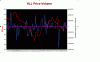
Attachments
-
 18.7 KB Views: 190
")