


Price bars and Bar Chart
The bar chart is the most popular chart used in technical analysis. It comprises of various price bars as shown in the chart bellow. The x-axis represents time and the y-axis represents price.
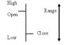
Price Bar
A bar chart is nothing but a vertical line bar in which the left hand tick shows the opening price and the right had tick shows the closing price for that period.
The top of the vertical bar indicates the highest price a security reached during the day (or period) and the bottom represents the lowest price.
The height of the bar (the distance from the highest to the lowest price) shows the range of prices for the period.
Opening price
The opening price tends to reflect the collective opinions of the public. These are primarily based on their emotional reaction to the events of the previous session as well as any news that had been released after the close of the last session.
High price
This is the maximum power of buyers for the day and is a level where supply overcame demand and sellers took control of the market. The exception here is when the market closed on the high. In this case, buyers retained control until the close of the market.
Low price
This is the maximum power of sellers during the day. The low price is the level where buyers took control from sellers and where demand overtook supply. There exception is when the market closes on the low indicating that the sellers were still in control when the market closed.
Closing price
The closing price is the result of the outcome of the battle between the bullsw and the bears. If the close is at the higher end of the bar it indicates that the bulls have won the battle. If the close is at the lower level of the day it indicates that the bears have won the battle. The close is also used to value accounts for margin purposes and tend to be the trigger for trading systems. The close therefore tells us at what price the battle of the bulls and the bears was resolved.
The bar chart is the most popular chart used in technical analysis. It comprises of various price bars as shown in the chart bellow. The x-axis represents time and the y-axis represents price.
Price Bar
A bar chart is nothing but a vertical line bar in which the left hand tick shows the opening price and the right had tick shows the closing price for that period.
The top of the vertical bar indicates the highest price a security reached during the day (or period) and the bottom represents the lowest price.
The height of the bar (the distance from the highest to the lowest price) shows the range of prices for the period.
Opening price
The opening price tends to reflect the collective opinions of the public. These are primarily based on their emotional reaction to the events of the previous session as well as any news that had been released after the close of the last session.
High price
This is the maximum power of buyers for the day and is a level where supply overcame demand and sellers took control of the market. The exception here is when the market closed on the high. In this case, buyers retained control until the close of the market.
Low price
This is the maximum power of sellers during the day. The low price is the level where buyers took control from sellers and where demand overtook supply. There exception is when the market closes on the low indicating that the sellers were still in control when the market closed.
Closing price
The closing price is the result of the outcome of the battle between the bullsw and the bears. If the close is at the higher end of the bar it indicates that the bulls have won the battle. If the close is at the lower level of the day it indicates that the bears have won the battle. The close is also used to value accounts for margin purposes and tend to be the trigger for trading systems. The close therefore tells us at what price the battle of the bulls and the bears was resolved.
Attachments
-
 7 KB Views: 177